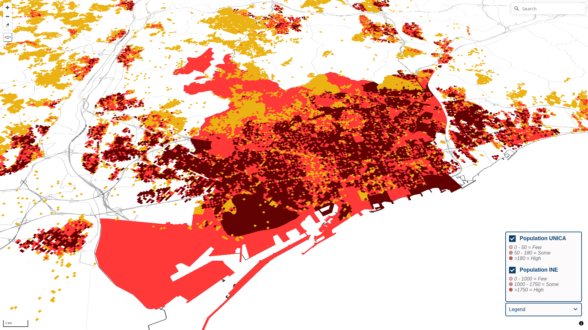
Air Quality vMaps

Hotfix for the vCity Air Quality app, with layers served by Martin.

Map 0 - Population

This map shows the population classified by ranges.

Layers used:

  • INE data
    • p <= 1000 = "Few"
    • p > 1000 && p <= 1750 = "Some"
    • p > 1750 = "High"
  • UNICA data
    • p <= 50 = "Few"
    • p > 50 && p <= 180 = "Some"
    • p > 180 = "High"

Map 1 - Concentration

This map shows the PM 2.5 concentration classified by ranges.

  • c <= 10 = "Low"
  • c > 10 && c <= 15 = "Mid"
  • >15 "High"

Layers used:

  • INE data
  • UNICA data

Map 2 - Population / Concentration - INE

This map shows the combination of the population and the PM 2.5 concentration classified by ranges.

  • Few/Low
  • Few/Mid
  • Few/High
  • Some/Low
  • Some/Mid
  • Some/High
  • High/Low
  • High/Mid
  • High/High

Layers used:

  • INE data

Map 3 - Population / Concentration - UNICA

This map shows the combination of the population and the PM 2.5 concentration classified by ranges.

  • Few/Low
  • Few/Mid
  • Few/High
  • Some/Low
  • Some/Mid
  • Some/High
  • High/Low
  • High/Mid
  • High/High

Layers used:

  • UNICA data

Map 4 - Attributable Deaths - INE

This map shows the attributable deaths symbolized by interpolation.

Layers used:

  • INE data
    • 0.295 - 3.210

Map 5 - Attributable Deaths - UNICA

This map shows the attributable deaths symbolized by interpolation.

Layers used:

  • UNICA data
    • 0.0 - 0.7